

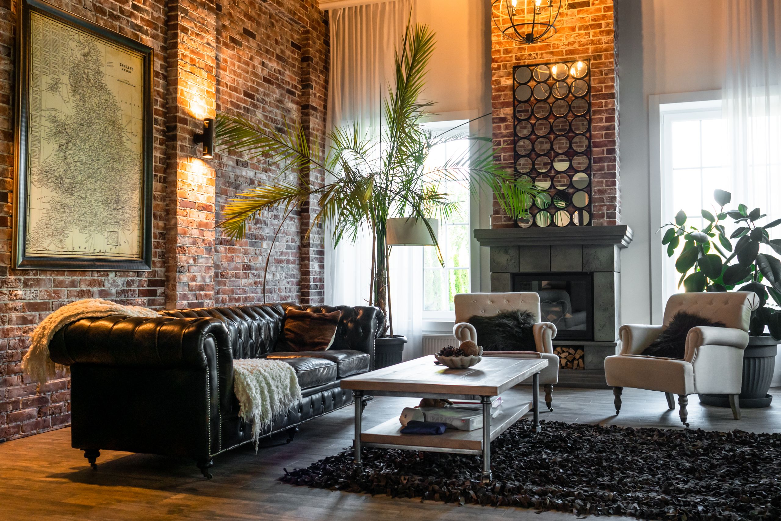
Color can change the entire personality of a living room without requiring a complete renovation. The right combination can make a space feel warmer, calmer, brighter, more sophisticated, or more connected to nature.
Contemporary interiors are moving beyond the once-common combination of cool gray, bright white, and minimal decoration. Warmer neutrals, earthy shades, muted greens, sophisticated blues, brown tones, and softer accent colors are giving modern rooms more personality while keeping them comfortable.
The trick isn’t simply choosing a fashionable paint color. Your walls need to work with the sofa, flooring, wood finishes, curtains, rugs, lighting, and decorative pieces already in the room.
Living room color ideas are combinations of wall, furniture, accent, and decorative colors chosen to create a particular atmosphere and visual balance. A successful palette considers lighting, existing materials, room size, and the relationship between dominant and accent colors.
If you’re refreshing your living room, the following 20 combinations offer different ways to approach contemporary color without making the room feel overly coordinated or dated.
20 Living Room Color Ideas for a Contemporary Look
1. Warm White and Natural Wood
Warm white creates a clean backdrop without the sharp appearance that some pure whites can produce. When combined with natural wood, it gives a living room a relaxed contemporary character.
Oak, walnut, ash, and other wood finishes can introduce warmth and texture. Linen curtains, woven baskets, beige upholstery, and natural-fiber rugs fit easily into this palette.
This combination works particularly well when you want the room to feel bright but not sterile.
Use warm white on the main walls and allow the wood to become the supporting visual element. Black metal lighting or a few darker accessories can add definition without disturbing the softness of the palette.
2. Soft Beige and Cream
Soft beige and cream are useful when you want a neutral room with more warmth than a traditional gray palette.
Cream can work on walls, while beige appears through sofas, rugs, curtains, or accent chairs. Layering slightly different neutral shades prevents the room from looking flat.
The combination is particularly effective with contemporary furniture featuring simple silhouettes.
For extra contrast, add dark brown wood, matte black hardware, or a muted green accessory. The result feels comfortable without becoming overly traditional.
3. Greige and Charcoal
Greige combines qualities of gray and beige, making it a flexible choice for contemporary interiors. Charcoal then provides the contrast needed to keep the palette from feeling too soft.
A greige wall can work with a charcoal sofa, dark coffee table, or black-framed windows. Lighter cream textiles can prevent the darker elements from taking over.
This is a useful choice for homeowners who like gray but want a warmer appearance.
Pay attention to undertones before painting. Some greiges lean warmer, while others appear noticeably gray under certain lighting.
4. Sage Green and Warm White
Sage green brings a subtle connection to nature without the intensity of brighter greens. Paired with warm white, it creates a calm and contemporary living room.
Sage works particularly well with oak furniture, cream upholstery, linen, rattan, and other natural textures.
You can use sage on all four walls if the shade is sufficiently muted, or introduce it through one wall, built-in shelving, or furniture.
Quick note: green can change noticeably between daylight and artificial light, so sample it at different times before making a final decision.
5. Olive Green and Cream
Olive green offers more depth than sage while remaining grounded and adaptable.
Cream helps soften the richness of olive, while walnut furniture and brass details can add sophistication. Leather seating can also work well here, particularly in warm tan or brown shades.
Olive is useful when you want a room with personality but don’t want a highly saturated accent color.
For a smaller living room, consider using olive on a feature wall or through furniture and accessories rather than covering every surface.
6. Muted Teal and Warm Neutrals
Muted teal sits between blue and green, giving it a distinctive contemporary quality. It can create visual interest without the intensity of a highly saturated turquoise.
Pair teal with beige, cream, warm white, or light taupe. Walnut furniture and brushed brass accents can reinforce the richer side of the palette.
Teal works particularly well as a controlled feature color.
Look — if you’re working with a neutral sofa and wood flooring, here’s what actually works: introduce teal through one architectural wall, an accent chair, curtains, or a carefully selected rug instead of using it everywhere.
7. Navy Blue and Soft White
Navy provides strong contrast while feeling less severe than black. With soft white, it creates a crisp contemporary palette that can work in both traditional and modern architectural settings.
Navy can be used on built-ins, cabinetry, one feature wall, or even a sofa. Soft white walls and lighter flooring keep the room balanced.
Add natural wood to make the combination feel warmer.
Brass or aged-metal details can also work well, but they should remain supporting elements rather than competing with the navy.
8. Powder Blue and Warm Beige
Powder blue creates an airy appearance, while warm beige keeps the room from becoming too cool.
This pairing can work especially well in living rooms with generous natural light. Beige furniture, oak flooring, cream textiles, and woven accessories help connect the two colors.
The combination is suitable for homeowners who want color without a dramatic statement.
If the room receives limited daylight, test the blue carefully. A soft blue that looks fresh in strong daylight may appear cooler or grayer under artificial lighting.
9. Terracotta and Cream
Terracotta brings an earthy, sun-baked quality to a contemporary interior. Cream gives the color enough breathing room to remain comfortable.
Use terracotta on an accent wall, occasional chair, cushions, artwork, or a rug. You can also combine it with warm wood and brown leather.
The palette works particularly well when the room already contains natural materials.
If the terracotta is strong, keep larger surrounding surfaces neutral. That allows the color to remain a focal point rather than making the room visually heavy.
10. Clay and Soft Gray
Clay is a muted earthy shade that can provide warmth without the stronger orange quality sometimes associated with terracotta.
Pairing clay with soft gray creates an interesting balance between warm and cool elements. The result can feel contemporary without becoming overly colorful.
Consider clay walls with a soft gray sofa, pale wood furniture, and cream textiles.
This combination works well when you want an earthy palette but aren’t ready to commit to deep brown or red-based colors.
11. Dusty Pink and Brown
Dusty pink can be surprisingly sophisticated when combined with brown rather than brighter pink or stark white.
The muted quality of dusty pink works with walnut, chocolate brown, cream, and warm beige. These supporting colors give the palette enough depth for a contemporary living room.
Use dusty pink on walls if you want a softer atmosphere, or introduce it through textiles and furniture for a more restrained approach.
Or maybe I should say it this way: the goal isn’t to make the room look pink. It’s to introduce a subtle warm undertone that works with the rest of the furnishings.
12. Chocolate Brown and Cream
Chocolate brown adds depth and warmth, while cream prevents the room from becoming too dark.
This combination can be used in several ways. Brown may appear through furniture, wood, a feature wall, or architectural details, while cream handles the larger lighter surfaces.
Leather sofas, walnut tables, woven rugs, and brass details can fit naturally into this palette.
Dark brown can also create a cozy feeling in larger living rooms where lighter colors might otherwise leave the space feeling visually empty.
13. Charcoal and Warm White
Charcoal and warm white provide a strong contemporary contrast.
Charcoal works particularly well on a feature wall, fireplace surround, built-in shelving, or architectural section. Warm white can cover the remaining walls and larger surfaces.
The combination needs texture.
Add wood, linen, wool, stone, or woven materials so the room doesn’t become a collection of flat black-and-white surfaces. A warm wood floor can be especially effective here.
14. Deep Green and Soft Beige
Deep green creates a more dramatic atmosphere than sage or olive. Soft beige gives it a lighter partner that keeps the room approachable.
Natural wood is an excellent bridge between these two colors. Walnut, oak, leather, and woven materials can all support the palette.
Deep green can work across all four walls in a room with adequate light, especially when the furnishings are relatively light.
In a smaller or darker room, try it on one wall or through furniture instead.
15. Muted Yellow and Warm Neutrals
Muted yellow introduces energy without the brightness of a primary yellow.
It works best when surrounded by warm neutrals such as cream, beige, taupe, or light brown. Rather than making yellow the dominant color, use it through an accent chair, artwork, cushions, lamp, or smaller wall section.
This approach keeps the palette contemporary.
A muted yellow can also bring warmth to rooms that receive cooler daylight, although the exact effect depends on the paint’s undertone and the surrounding finishes.
16. Lavender and Warm Gray
Lavender provides an unexpected alternative to the more familiar green and blue palettes.
When paired with warm gray, it can feel subtle rather than overly decorative. Cream, natural wood, and simple black accents can help ground the combination.
The key is restraint.
Avoid adding too many additional accent colors. Let lavender and warm gray establish the visual identity, then use texture and furniture shapes to create interest.
17. Cream, Camel, and Black
This three-color palette demonstrates how neutrals can still have strong visual character.
Cream provides the light base. Camel introduces warmth. Black supplies definition.
A cream wall with camel upholstery and black lighting or furniture frames can create a polished contemporary appearance.
The black should usually be controlled rather than dominant. Think of it as punctuation.
This combination is especially useful for homeowners who want a modern room without relying on colorful walls.
18. Blue, Brown, and Cream
Blue and brown balance cool and warm qualities naturally.
Cream provides the transition between them. Brown can appear through leather seating, walnut furniture, flooring, or decorative pieces, while blue can be introduced through walls, cushions, artwork, or an accent chair.
The exact blue can change the character of the room. Navy feels dramatic, dusty blue feels softer, and muted blue-green feels more organic.
This palette is flexible enough for both relaxed and more formal contemporary interiors.
19. Monochromatic Green
A monochromatic green palette uses several shades of the same color family instead of relying on one green alone.
For example, a room might combine a soft green wall with deeper green seating, olive accessories, and pale green textiles.
The advantage is visual continuity.
Texture becomes particularly important because similar colors need differences in material and depth to remain interesting. Velvet, linen, wood, wool, and matte surfaces can all help.
Most people assume monochromatic rooms need identical shades. They don’t. Small changes in value and saturation are what create depth.
20. Earthy Neutral Color Palette
For a highly adaptable contemporary room, combine taupe, sand, clay, brown, cream, and warm beige.
This palette doesn’t depend on one dominant color. Instead, several earthy shades work together to create a relaxed environment.
Wood, stone, leather, linen, woven materials, and ceramic accessories fit naturally into the scheme.
It is particularly useful for open-plan homes because the neutral colors can flow between the living room, dining area, and kitchen without creating abrupt visual changes.
Quick Comparison
| Color Idea | Best For | Key Benefit | Limitation |
| Warm White + Wood | Bright, natural interiors | Flexible and timeless | Can feel plain without texture |
| Sage + Cream | Calm, nature-inspired rooms | Soft and relaxing | Green undertones vary in different light |
| Navy + White | High-contrast contemporary rooms | Strong visual definition | Can feel heavy in poorly lit spaces |
| Terracotta + Cream | Warm, earthy interiors | Adds personality and warmth | Strong terracotta can dominate |
| Teal + Beige | Statement contemporary rooms | Rich color with neutral balance | Works best when teal is controlled |
| Chocolate + Cream | Cozy, sophisticated spaces | Adds depth and warmth | Too much brown can darken the room |
How to Choose the Right Living Room Color
Finding attractive living room color ideas is only the first step. The bigger question is whether a particular palette will work inside your actual room.
A color that looks beautiful in an online photograph can behave very differently on your wall. Lighting, flooring, ceiling height, furniture, and nearby colors all influence what your eye sees.
Consider Natural Light
Natural light is one of the biggest factors affecting paint color.
North-facing rooms often receive cooler, less direct daylight, which can make some colors appear cooler or more muted. Warm neutrals can help counter that effect.
South-facing rooms generally receive stronger and warmer natural light for more of the day. Cooler colors may therefore feel more balanced.
East-facing rooms can change considerably between morning and afternoon, while west-facing rooms may become warmer later in the day.
Test samples at different times.
Look at Your Existing Furniture
Your sofa may already be the most visually dominant object in the room. That makes it a logical starting point.
Look closely at:
- Sofa and accent-chair colors
- Flooring and rugs
- Curtains and window treatments
- Wood finishes
- Artwork
- Metal finishes
- Fireplace or stone surfaces
A beige sofa doesn’t mean you need beige walls. Olive, navy, terracotta, chocolate brown, cream, and muted blue can all create different results.
The same principle applies to gray furniture. Instead of matching gray with more gray automatically, look at whether the sofa has warm or cool undertones.
Decide Between Warm and Cool Colors
Warm colors generally include shades with yellow, red, orange, or brown undertones. Cool colors tend toward blue, green, and blue-violet.
Neither category is automatically more contemporary.
A warm palette can make a large room feel inviting, while a cool palette can give a bright space a crisp and airy character. The surrounding materials matter just as much as the color temperature itself.
Warm wood can make a cool wall color feel more balanced. Likewise, cool blue-gray furniture can temper a warm beige room.
Think About Room Size
Light colors can contribute to an airy visual impression, especially when walls, trim, and larger furnishings have relatively low contrast.
Dark colors can also work in small rooms. They don’t physically make the room smaller, although they can create a more enclosed visual atmosphere.
The amount of natural light, ceiling height, furniture scale, and contrast between surfaces all influence the perceived size.
A small living room doesn’t automatically need white walls.
How to Build a Contemporary Living Room Color Palette
Choosing one beautiful color is easier than creating a complete palette. A useful approach is to divide the room into dominant, supporting, and accent colors.
Choose a Dominant Color
The dominant color usually occupies the largest visual area.
It might be the wall color, flooring, large sofa, or a combination of these elements.
Warm white, cream, beige, greige, or another restrained shade can provide an easy foundation, but a stronger color such as deep green or navy can also become the dominant element.
Add a Supporting Color
The supporting color helps connect the major surfaces.
This could come from the sofa, curtains, rug, cabinetry, or larger furniture pieces.
For example, warm white walls can be supported by beige upholstery and natural wood. Deep green walls might be supported by cream seating and walnut furniture.
The supporting color doesn’t have to match the dominant color exactly.
Introduce an Accent Color
Accent colors should appear in smaller quantities.
Artwork, cushions, lamps, ceramics, books, plants, and occasional chairs are easy places to introduce them.
If your room already contains several strong colors, keep the accent restrained. One repeated accent usually has more impact than several unrelated colors competing for attention.
Repeat Colors Throughout the Room
Color repetition creates cohesion.
If navy appears in one chair, repeating a small amount of navy in artwork or cushions can make the choice feel intentional.
The same works with wood, cream, green, brown, or terracotta.
A color doesn’t need to appear everywhere. It simply needs to appear often enough for the eye to recognize a relationship.
How to Test a Living Room Color Before Painting
To reduce guesswork, follow these steps:
- Identify existing furniture and flooring colors.
- Choose two or three possible palettes.
- Test large paint samples in the actual room.
- View them in morning, afternoon, and evening light.
- Compare each sample with your sofa, flooring, and curtains.
Small swatches can be misleading because surrounding colors affect perception. A larger sample gives you a better idea of how the shade behaves across a wall.
Living Room Color Ideas for Different Styles
Minimalist Contemporary
Minimalist contemporary rooms often work well with warm white, cream, beige, greige, and soft gray.
The palette should remain relatively restrained, with interest coming from texture, furniture shapes, lighting, and natural materials.
Warm Contemporary
Warm contemporary interiors can combine terracotta, cream, camel, brown, warm white, and natural wood.
The result can feel modern without becoming cold or overly minimal.
Moody Contemporary
Charcoal, deep green, navy, and chocolate brown can create a darker contemporary atmosphere.
The room benefits from layered lighting and lighter textiles so the deeper colors don’t become visually overwhelming.
Nature-Inspired Contemporary
Sage, olive, clay, beige, cream, and natural wood create a strong nature-inspired combination.
This approach works especially well with linen, rattan, stone, wool, and other tactile materials.
Bold Contemporary
Teal, deep blue, muted yellow, and carefully controlled contrasting colors can give a contemporary room more personality.
The key is to select one dominant statement color and allow the remaining palette to support it.
Common Living Room Color Mistakes to Avoid
Choosing Paint From a Tiny Swatch Alone
A tiny color card cannot show you how an entire wall will look.
Large samples are much more useful because they reveal undertones and how the shade interacts with surrounding surfaces.
Ignoring Existing Flooring and Furniture
New paint doesn’t exist in isolation.
A wall that looks neutral in an empty room can look noticeably warmer, cooler, darker, or lighter beside a particular wood floor or sofa.
Using Too Many Competing Colors
A contemporary room doesn’t need a different accent color for every object.
Choose a clear dominant color, a supporting color, and one or two controlled accents.
Forgetting About Lighting
Artificial bulbs can change the appearance of paint after sunset.
Check your samples under the lighting you actually use in the evening.
Making Every Surface the Same Color
Using one color throughout the room can create a cohesive appearance, but it isn’t the only way to achieve visual continuity.
Different shades, textures, and finishes can provide much more depth.
Following Trends Without Considering the Room
A color can be popular without being suitable for your specific space.
Trends are useful sources of inspiration. They shouldn’t replace practical evaluation of light, furniture, flooring, and personal preference.
FAQs About Living Room Colors
What is the best color for a contemporary living room?
There isn’t one universally best color. Warm white, beige, greige, muted green, blue, and earthy shades can all work depending on lighting, furniture, room size, and the atmosphere you want.
What colors make a living room look modern?
Warm whites, beige, greige, muted greens, sophisticated blues, earthy browns, charcoal, and carefully controlled accent colors can all create a modern appearance.
The overall combination matters more than one individual shade.
Should a contemporary living room be warm or cool?
Either can work. Warm colors can create a comfortable and grounded atmosphere, while cool colors can feel crisp and airy. Existing materials and natural light should help guide the decision.
What colors make a living room look bigger?
Lighter colors can contribute to an open, airy appearance, particularly when there is good natural light and limited contrast between major surfaces.
However, furniture scale, lighting, ceiling height, and layout also affect perceived space.
Are dark colors good for living rooms?
Yes. Dark colors such as navy, charcoal, deep green, and chocolate brown can create depth and intimacy.
They work particularly well when balanced with lighter furniture, adequate lighting, reflective surfaces, or natural textures.
What colors go well with a gray sofa?
Warm white, cream, beige, muted green, navy, blue, terracotta, and selected earthy accents can all work with gray.
Check whether the gray sofa has warm or cool undertones before choosing the wall color.
What colors go well with a beige sofa?
Olive, sage, terracotta, navy, chocolate brown, cream, and muted blue are useful options.
The exact choice depends on whether the beige is warm, neutral, or slightly gray.
How many colors should a living room have?
There is no mandatory number.
A practical starting point is one dominant color, one supporting color, and one accent color. Additional shades can come from natural materials and subtle variations of those colors.
What are contemporary living room colors for 2026?
Current contemporary palettes include warmer neutrals, earthy shades, muted greens, sophisticated blues, brown tones, and more nuanced accent colors.
The broader direction is toward rooms with warmth and personality rather than strictly cool, minimalist palettes.
Should all four living room walls be the same color?
Not necessarily.
Using one color across all four walls can create a calm, cohesive appearance, while a feature wall can provide stronger contrast. The right choice depends on the architecture, lighting, furniture, and desired mood.
Quick Voice-Search Answers
What’s the best way to choose a living room color?
Start with your existing sofa, flooring, wood tones, and natural light. Then shortlist two or three palettes and test large samples at different times of day.
How do I make a colorful living room look contemporary?
Keep one color dominant, use neutral supporting surfaces, repeat the accent color in small details, and balance saturated shades with natural textures.
Should I choose my sofa or wall color first?
If you already own the sofa, use it as a reference. Its undertone and fabric color can help narrow down suitable wall colors.
Why does paint color look different at night?
Artificial lighting changes how colors are perceived. Bulb temperature, brightness, shadows, and nearby surfaces can all affect the appearance of paint.
When should I use a dark color on all four walls?
Consider it when you want a more intimate atmosphere and the room has sufficient lighting and furnishings that can balance the darker surfaces.
Final Thoughts
The most useful living room color ideas aren’t necessarily the boldest or newest ones. A successful palette is one that works with the room you actually have.
Start with your natural light, flooring, sofa, wood finishes, and existing décor. From there, decide whether you want a warm neutral foundation, an earthy palette, a nature-inspired green scheme, a sophisticated blue combination, or a deeper contemporary atmosphere.
Current design trends can provide useful inspiration, but they don’t have to dictate the final choice. A warm white and natural wood combination may remain useful long after a particular trend disappears, while muted teal or deep green can give a room more personality when used thoughtfully.
Shortlist two or three combinations before buying paint. Test them in the actual room, watch how they change from morning to evening, and compare them with your furniture.
The goal isn’t simply to choose a beautiful color.
It’s to create a living room where the colors, materials, furniture, and lighting feel like they belong together.
